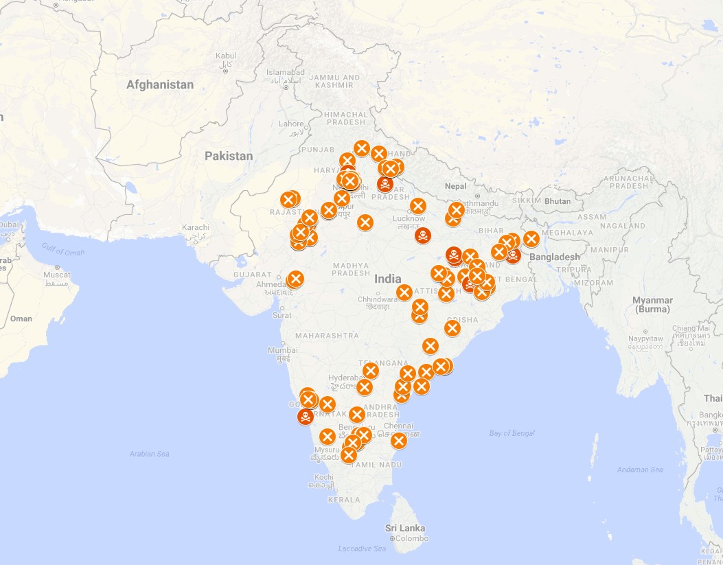
UIDAI’S Aadhaar has been attracting scathing criticism from various quarters, as the number of cases of denial of service, including rations under the Public Distribution System (PDS) to the most socio-economically disadvantaged people in society, is growing every day. This has prompted a group of youngsters to come up with the Aadhaar Fail Map, a living project that maps every Aadhaar failure, its causes as well as consequences. The project is the brain child of three friends, journalists Siddhartya Roy and Amit Bansal as well as economist Anmol Sonmachi. We caught up with Roy for a quick tete-a-tete:

Q) What made you come up with this project?
A) Aadhaar has failed but the UIDAI remains stubborn and remorseless. People are starving because they have been denied food under PDS. But the UIDAI is using its considerable political and financial clout to disown the problem. Sometimes it even refuses to acknowledge the problem. That’s when we decided to put together each instance of Aadhaar failure and put it on a map to show the full extent of the impact of these failures.
Q) Tell us a bit about your team.
A) It started with the three of us. Amit is a journalist, Anmol is an economist and I am a coder and also a journalist. We started by scraping the internet, news websites as well as social media feeds of trusted news sources, for instances of Aadhaar failure. In one day we put together 200 cases that took place in 2017 and in 2018 so far. But now help has started pouring in with many others willing to volunteer.
Q) How do you do your fact checking?
A) We only pick information from trusted news agencies, newspapers and news websites where we know the editorial team is a stickler for accuracy. Also when it comes to social media we would only take tweets and posts seriously if they are from verified Twitter sources or people we know have worked in this area and have solid intel on the subject.
Q) How do you present this information?
A) You will see X marks on places on the map where there has been a denial of service. If this has led to a death you will see a skull-and-bones icon. When you click on the X mark or the icon you can see the date, the name of the person affected, some information of what happened and why, plus the source of the information.
Q) What do you plan to do with this project now?
A) Well, it is a living project and soon we should be able to set up a platform for people to share information about their own Aadhaar failure experiences. Basically we want to bypass the isolation of individual reporting. Make it more organic using open channels. Of course, each instance will be fact checked. We hope to get more volunteers for human vetting. We also plan to scrape the official social media pages and handles of cell phone service providers, banks etc. to get more information about Aadhaar failures.
The Aadhaar Fail Map may be viewed here: https://codecoolie.io/map_of_aadhaar_failures_2017_18.html